Case study
App design
Research
Meet Seek, Job Search Ally
Job searching is typically overwhelming, disparate, and disorganized. I aimed to disrupt the norm with Seek by creating an intuitive, determined, and empowering platform. This case study takes you through how I transformed job searching from being riddled with friction to more seamless, more human – from initial discovery through pixel-perfect design.
🔍 Problem Digger
🧠 Flow Sculptor
📦 System Thinker
🎛️ Interaction Tweaker
✏️ Idea-to-Interface Translator
🧊 Simplicity Hacker
🚧 The Problem
Recruiters are left struggling to work through endless platforms, irrelevant jobs, and clunky interfaces. It is all too common to feel lost, stressed, or even burned out by the process. There is nowhere that really values the user's time or frame of mind in searching.
🎯 My Mission
Seek was my answer to all this disorganization — a site built to simplify job searching with simplicity, calm, and control. With intuitive flows, pinpoint-focused filters, and carefully considered design system, every element was built to make this process human and workable.
Project Impact
In those initial few weeks since launch, Seek assisted in generating fresh CVs, monitoring applications, and submitting jobs more quickly – with less friction. But more importantly, numbers aside, is how this makes you feel: in charge, centered, not overwhelmed. That is the victory.
🧠 Empathize
o understand the real pain of job hunting, I spoke to 7 people across different industries — from fresh grads to mid-level professionals. One common theme stood out: they felt lost in platforms designed more like spreadsheets than experiences. One user literally said, 'It feels like gambling. You shoot your CV into the void and pray.'
I charted emotional ups and downs throughout their experience, from exhilaration to worry to exhaustion. That's when I realized it: Seek wasn’t just about being utilitarian, it needed to restore confidence and clarity along the way.

📊 Analyze
I dove deep into platforms like LinkedIn, Glassdoor, Behance Jobs, and even newer tools like Polywork. While packed with features, most felt bloated — with noisy dashboards, irrelevant suggestions, and minimal control over applications.
I documented over 15 weak points across these platforms. Key gaps included:
1
No centralized space to track progress
2
Overwhelming UX with too much friction
3
Zero emotional tone, everything felt cold and robotic
These cracks became Seek’s creative fuel. I wasn’t here to redesign the wheel — I was here to rethink the ride.
✏️ Ideate
Armed with insights and frustrations, I began sketching crazy ideas on paper — no filters, no Figma yet. I explored everything from swipe-to-apply flows to mood-based job filters (yes, really). The goal wasn’t just usability, but emotional relief.
After 30+ wireframe variations and hours of flow-tuning, patterns started forming: calm UI, ultra-clear steps, and a sense of progress without pressure.
Seek’s concept started to crystallize — less like a job board, more like a personal assistant with taste.
🎨 Design
Designing Seek wasn’t just about making things look good — it was about making job hunting feel better. In this section, I’ll walk you through the visual backbone of the product: the modular design system, focused UI screens, and the subtle microinteractions that bring everything to life. Every pixel had a purpose — to create clarity, comfort, and confidence.
Let’s dive into the details that make the difference. 👀✨
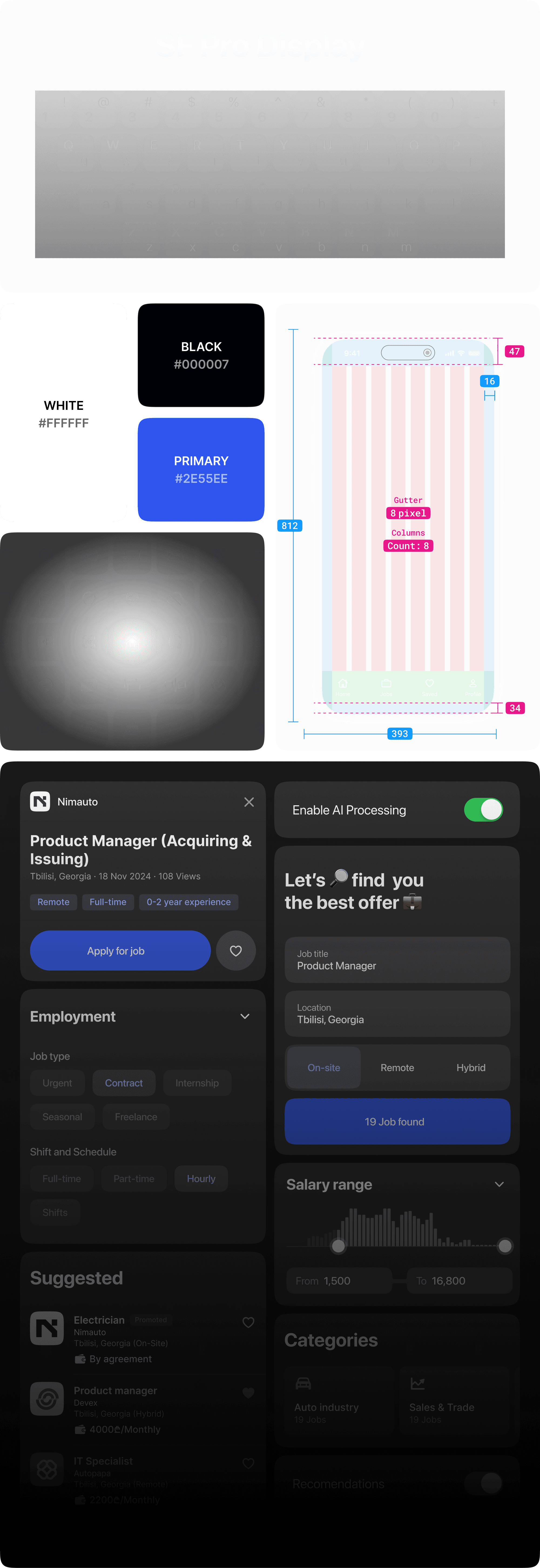
🧩 Design System
To keep things consistent, scalable, and smooth to build on, I crafted a custom design system tailored for Seek. Every atom — from buttons to shadows — was built with intention. I focused on clean typography, generous spacing, and a soft visual rhythm to make the experience feel calm and intuitive.
This system wasn’t just for structure — it was my way of giving the product a soul. Let’s break it down. 🛠️✨
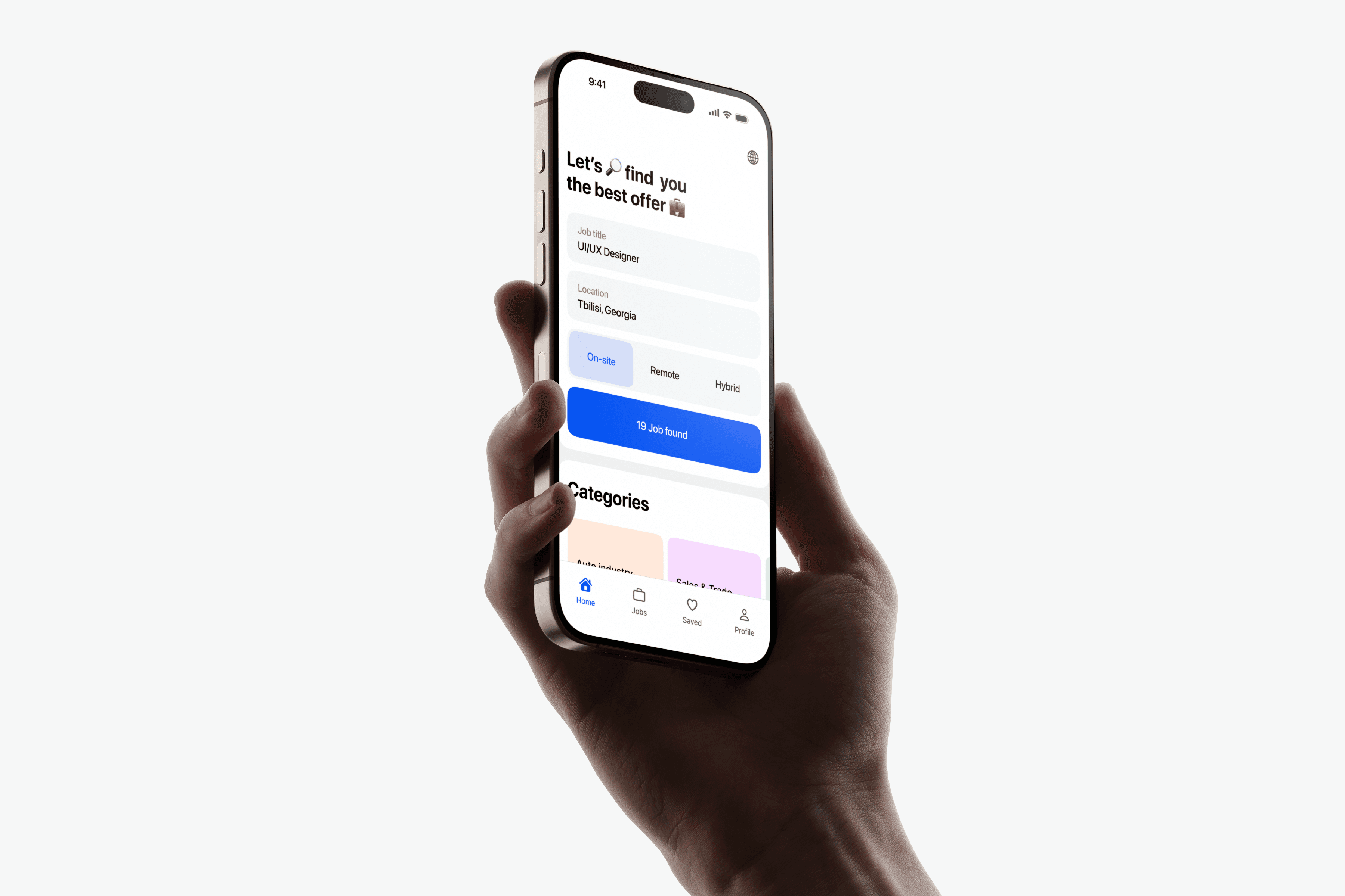
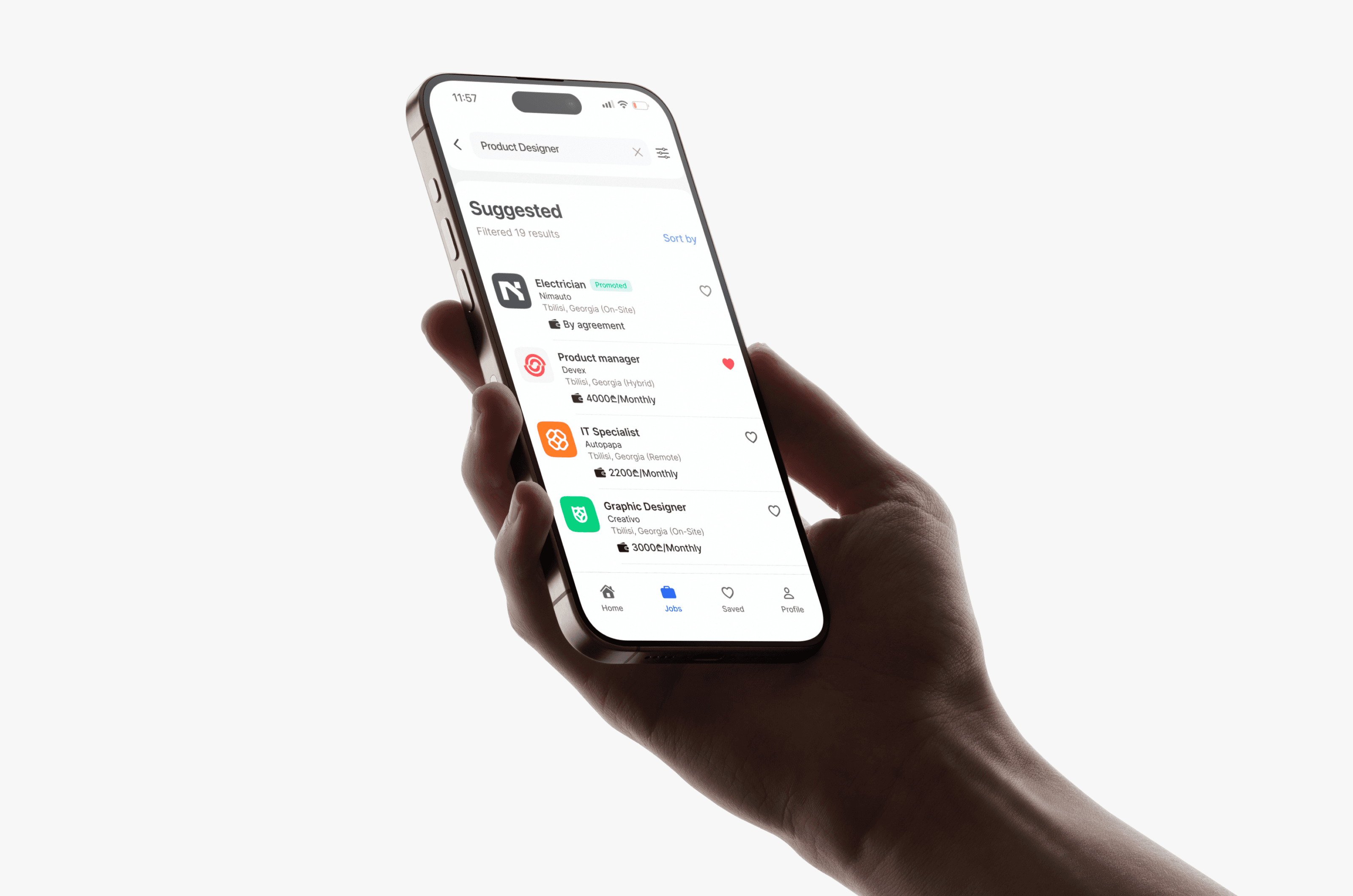
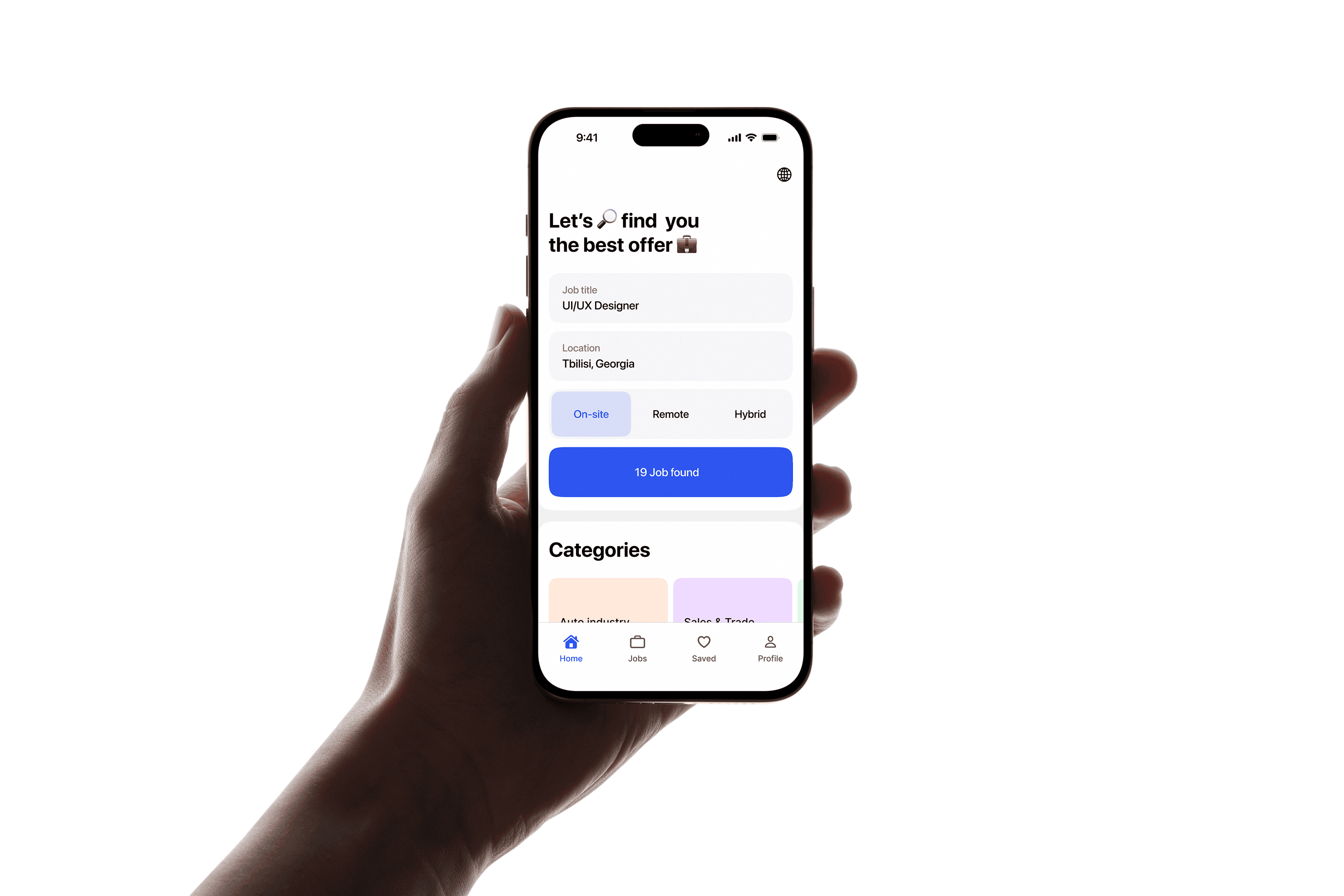
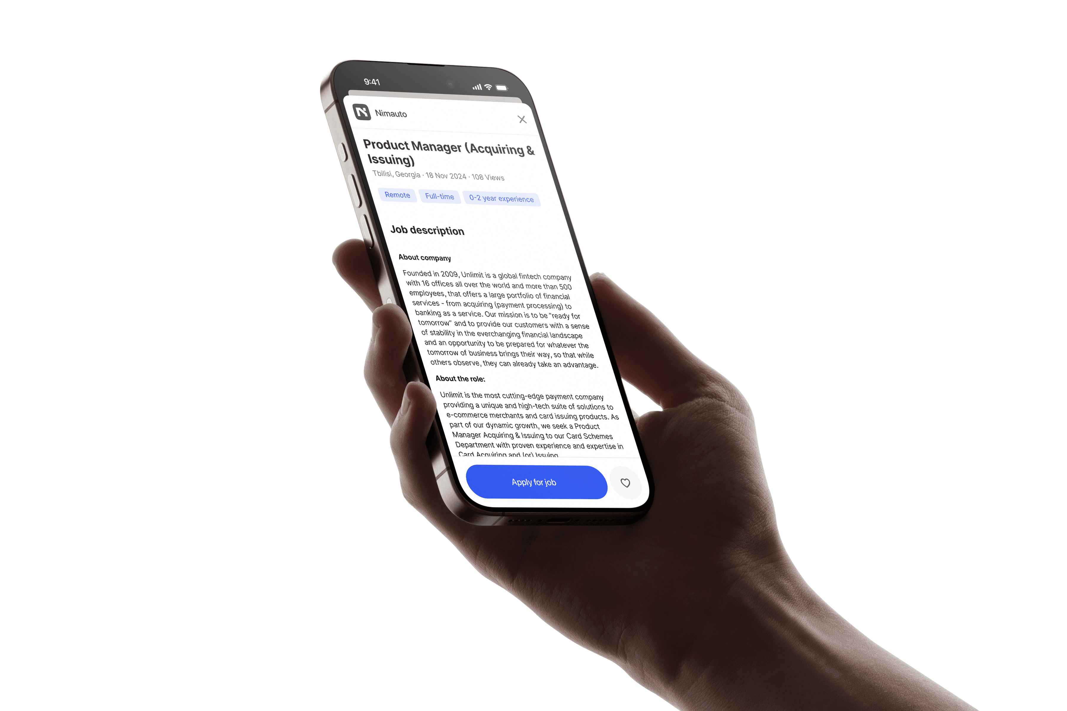
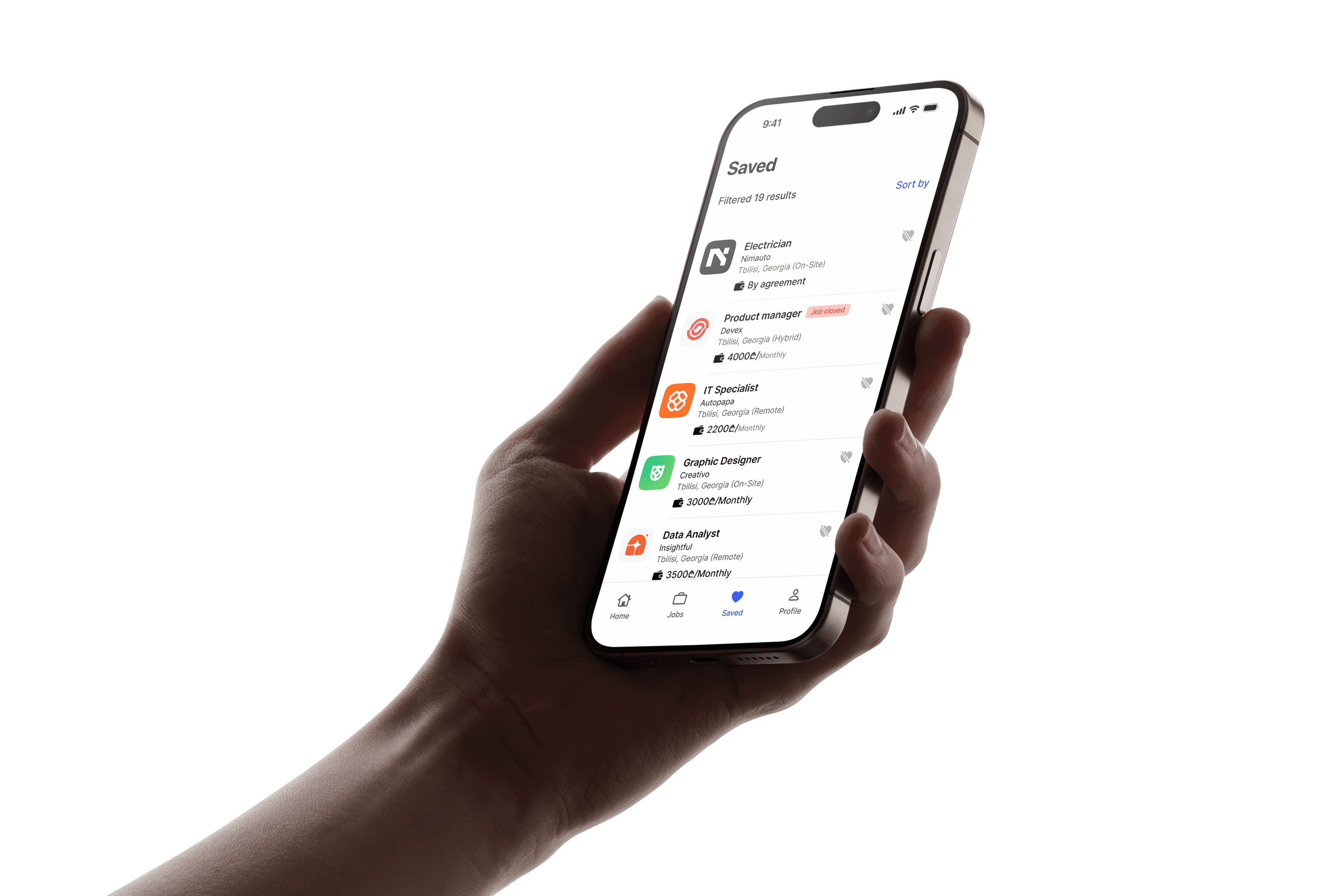
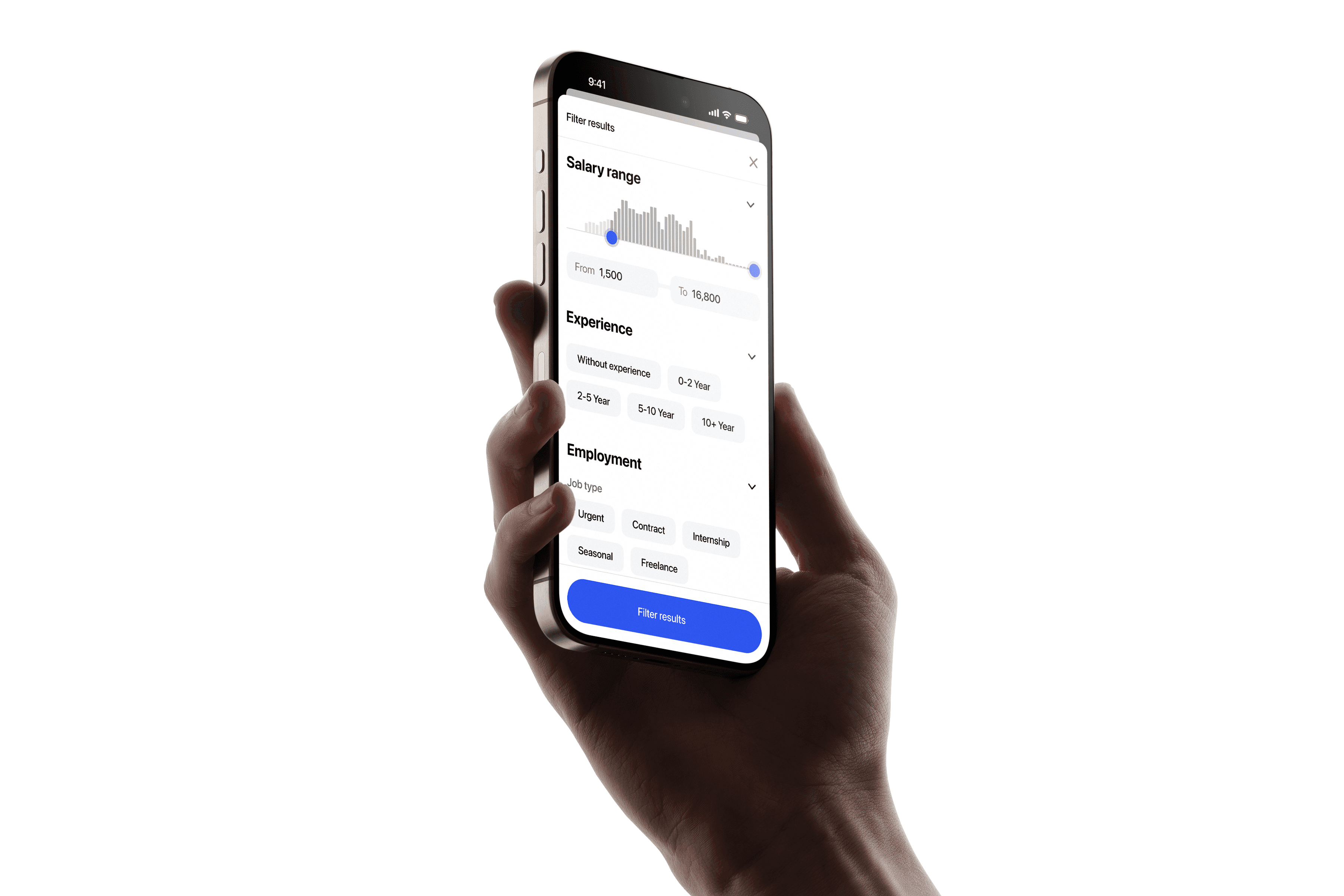
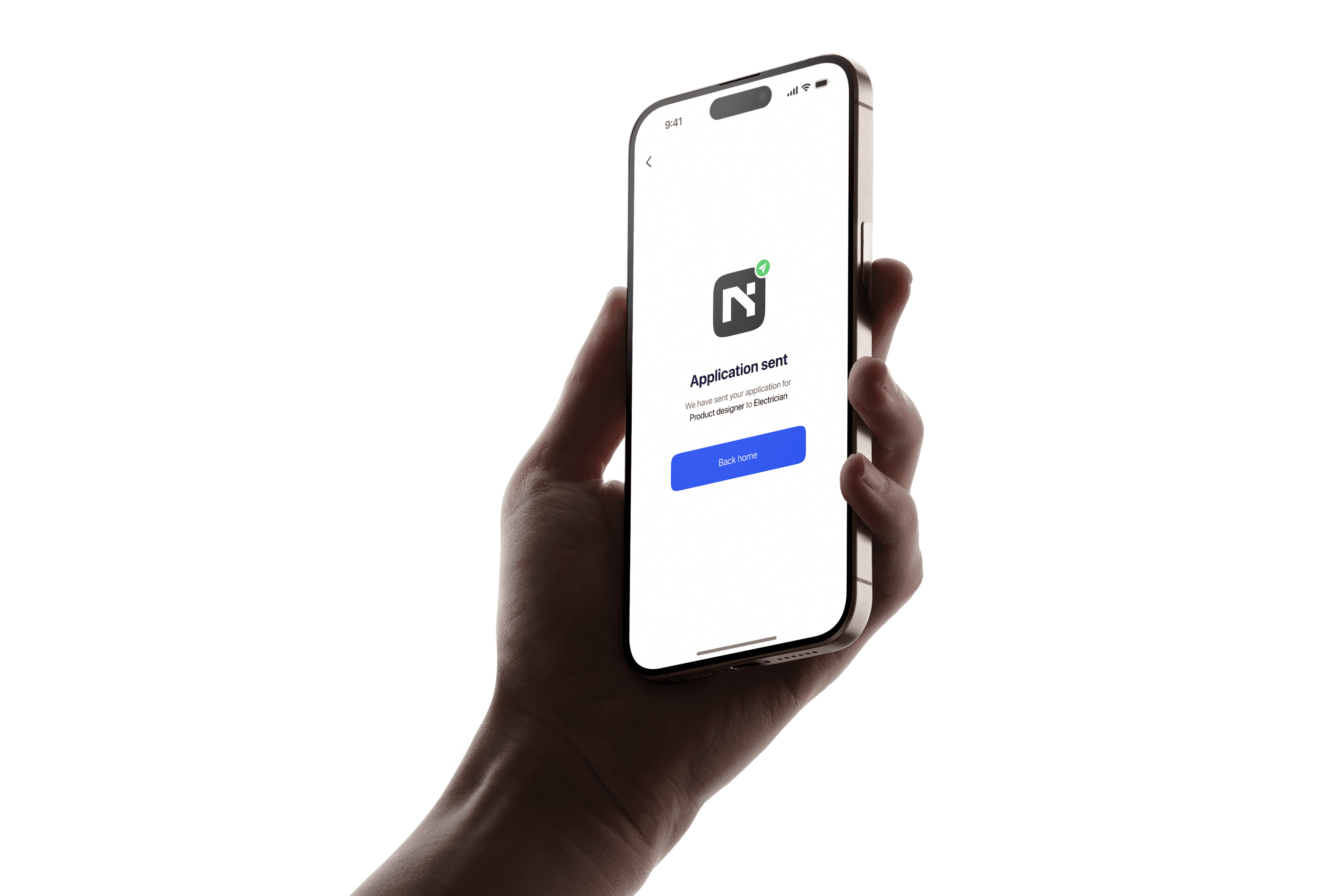
🖼️ Key Screens & Flows
With the system in place, I brought Seek to life through focused, user-driven screens. Each view was designed to remove noise, guide attention, and feel genuinely helpful — from the calming onboarding flow to the intuitive job-tracking dashboard.
I wasn’t just designing layouts; I was shaping moments. Moments where users feel seen, supported, and in control.
Let me walk you through the screens that define the Seek experience. 🚀
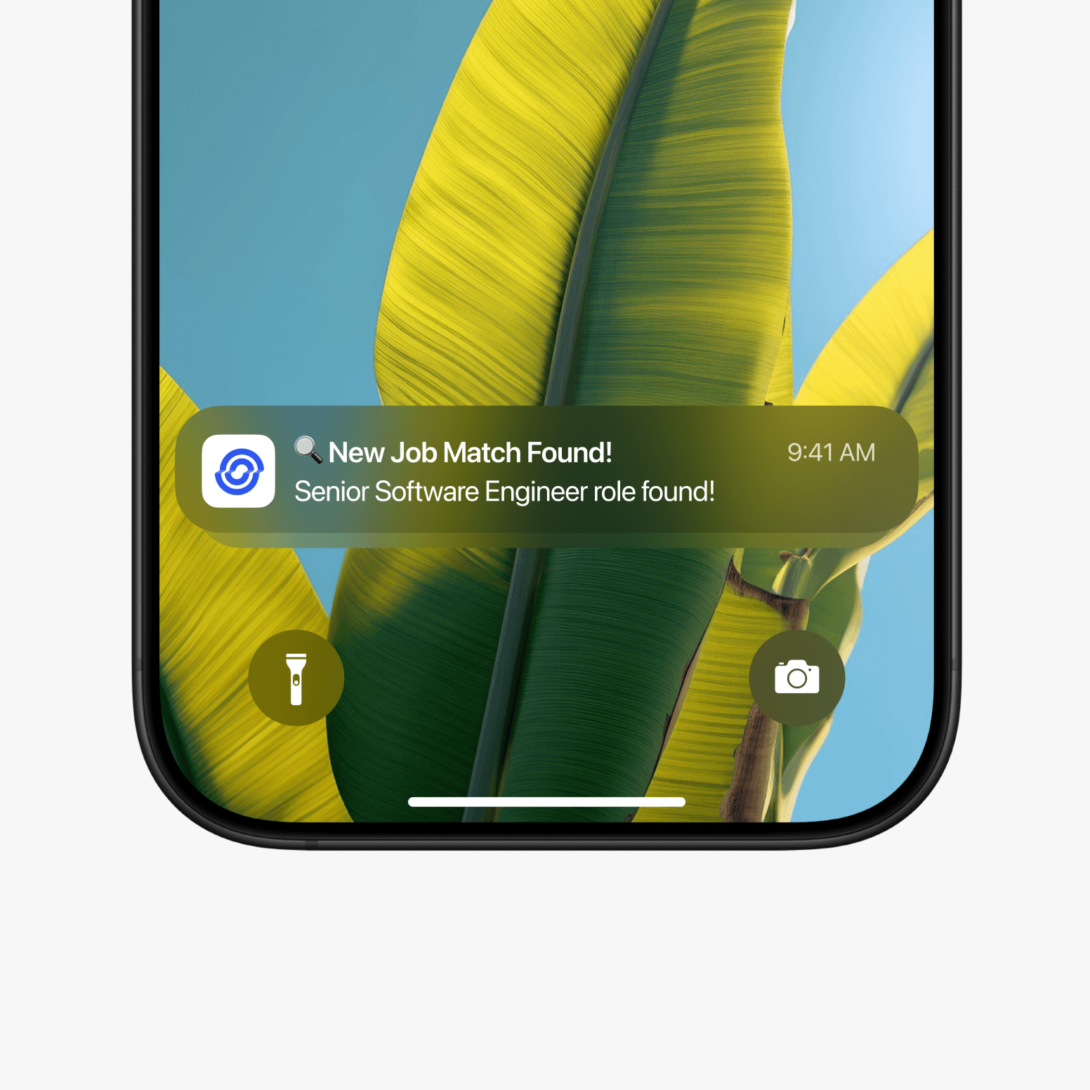
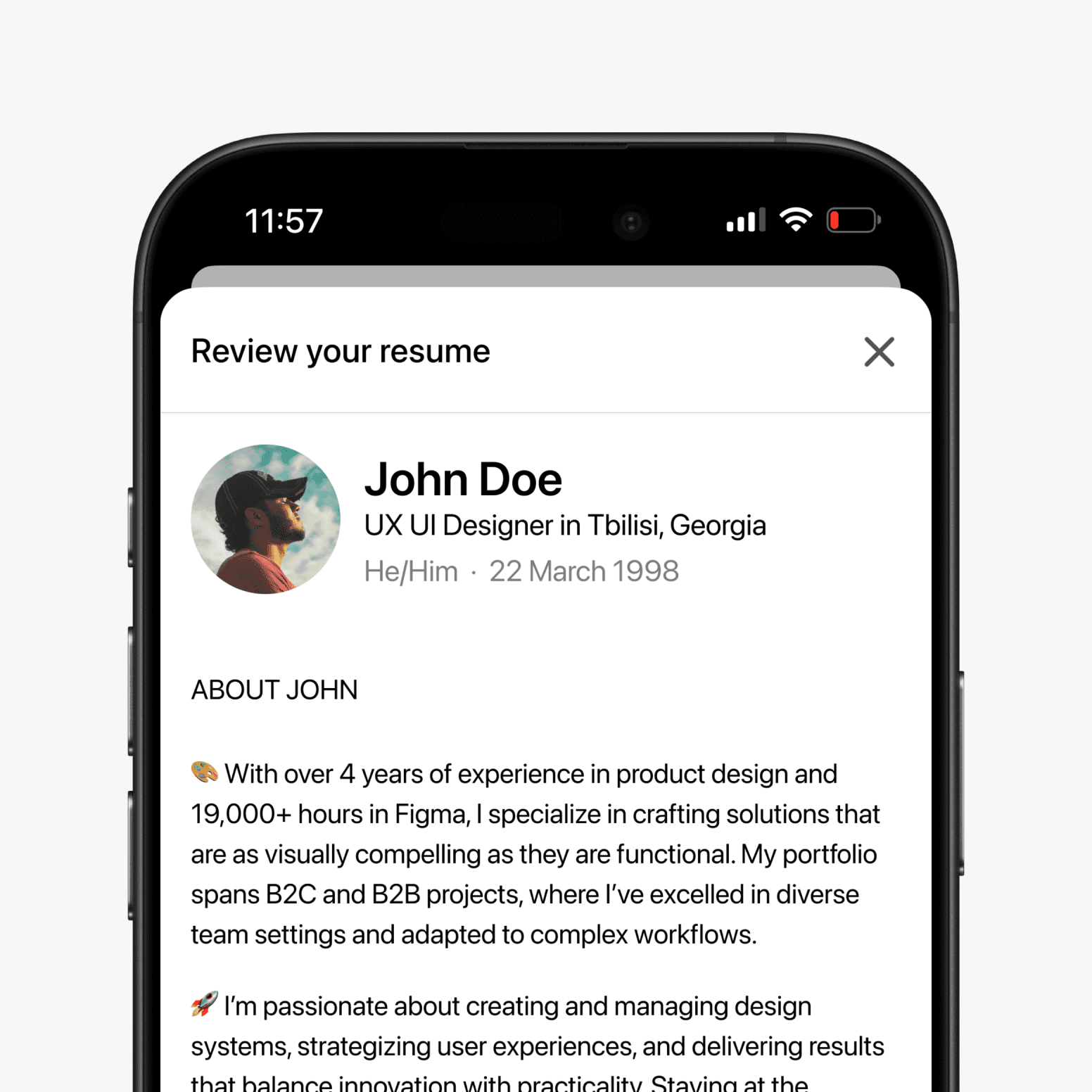
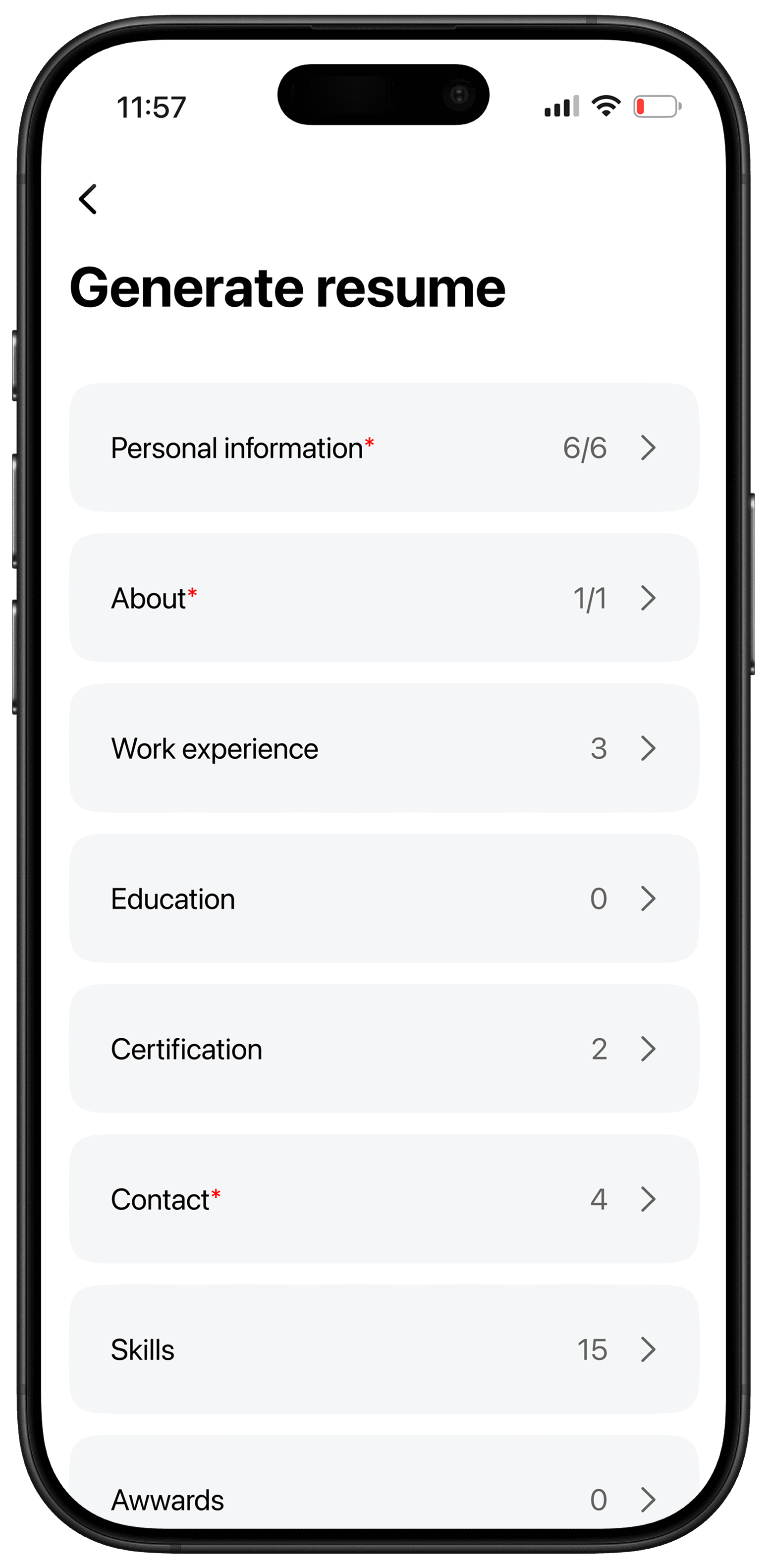
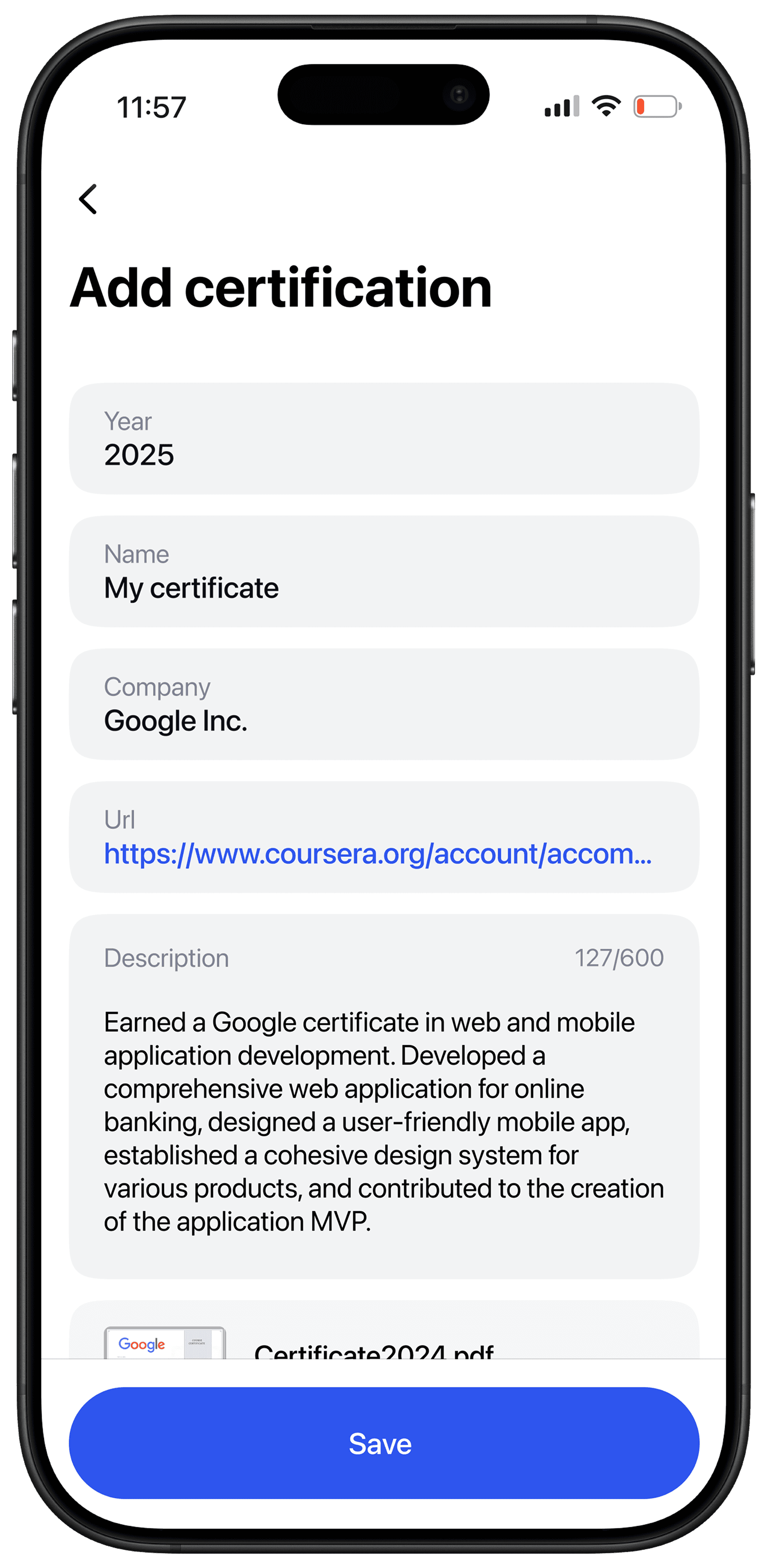
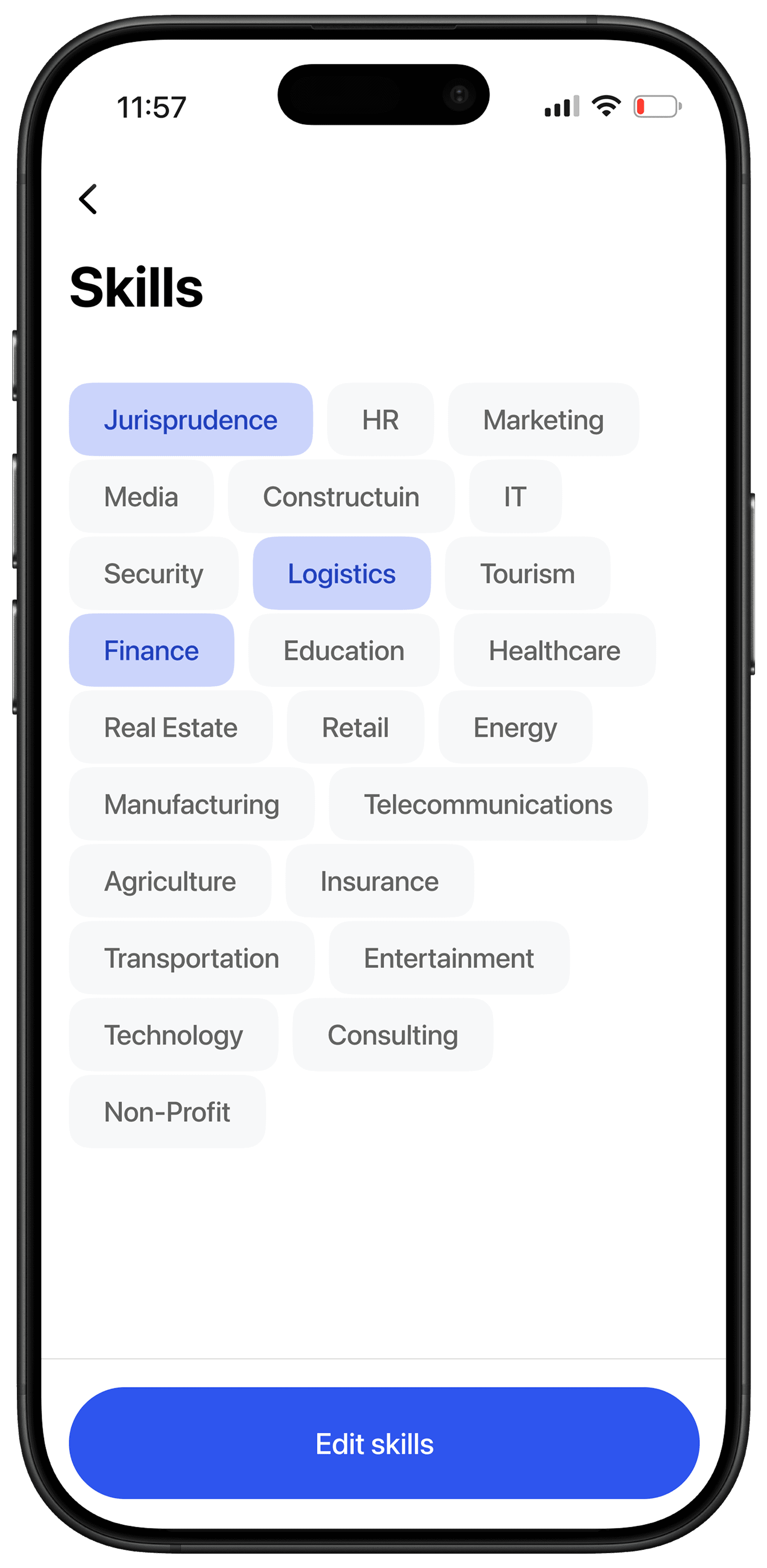
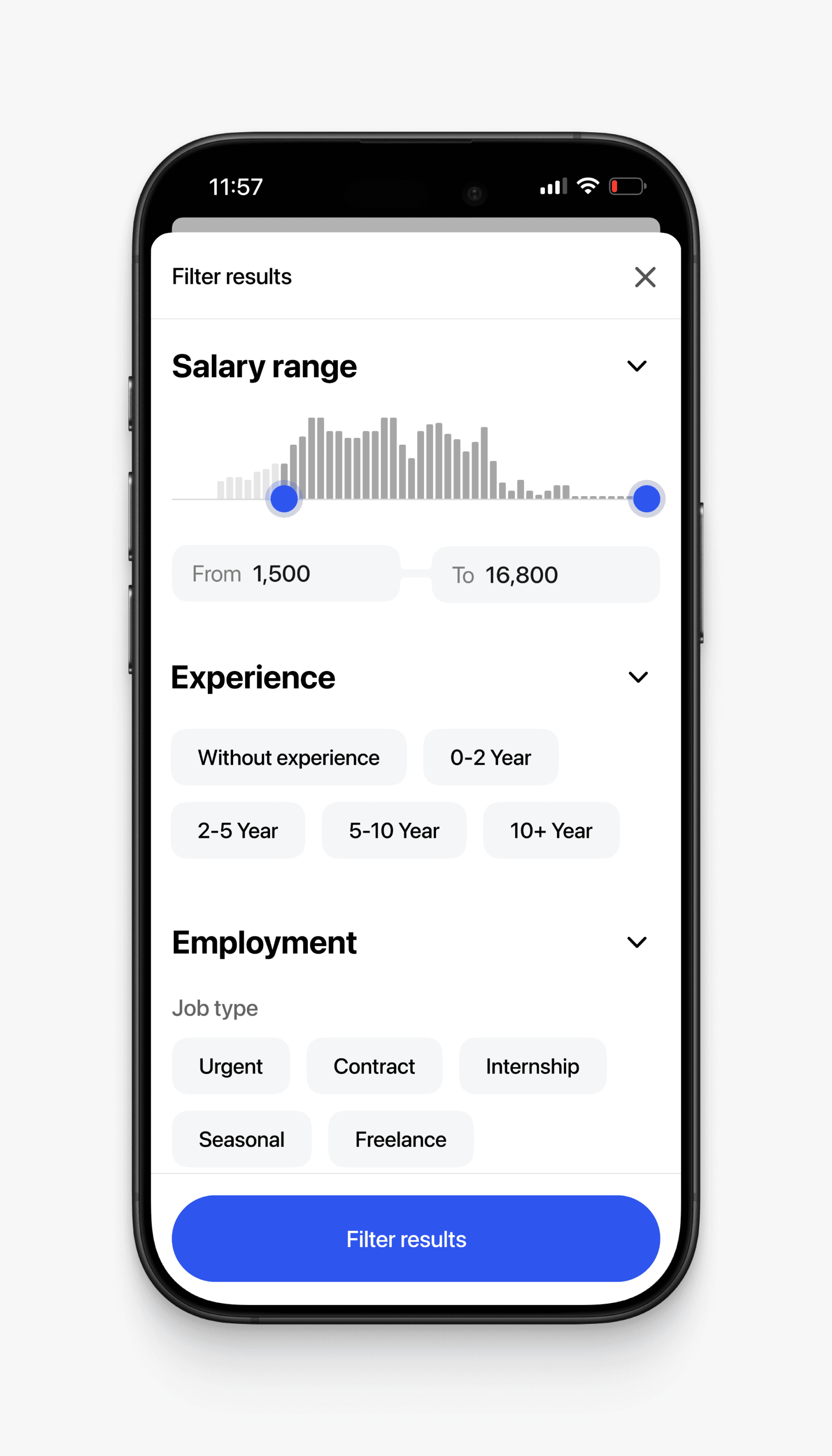
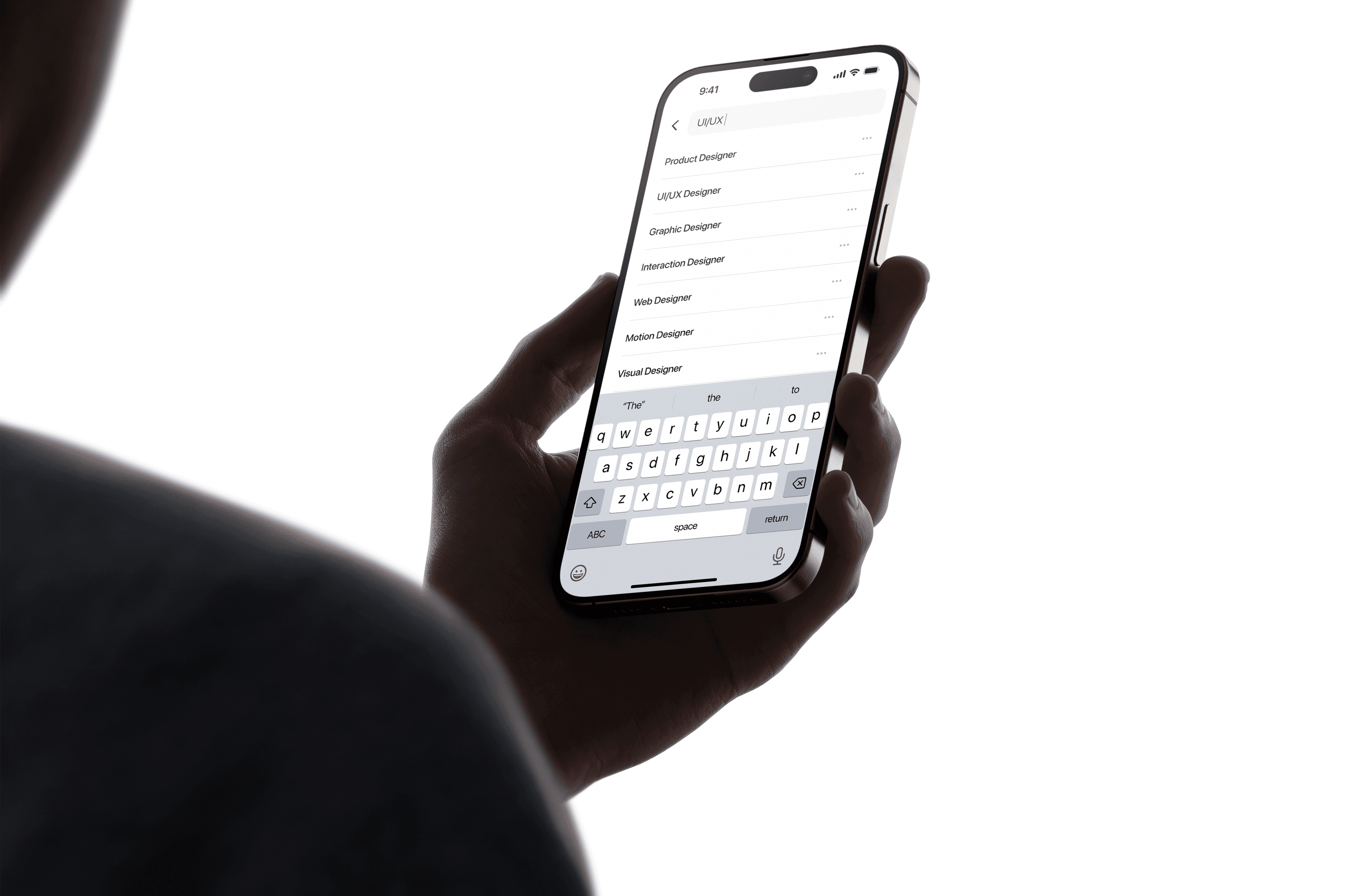
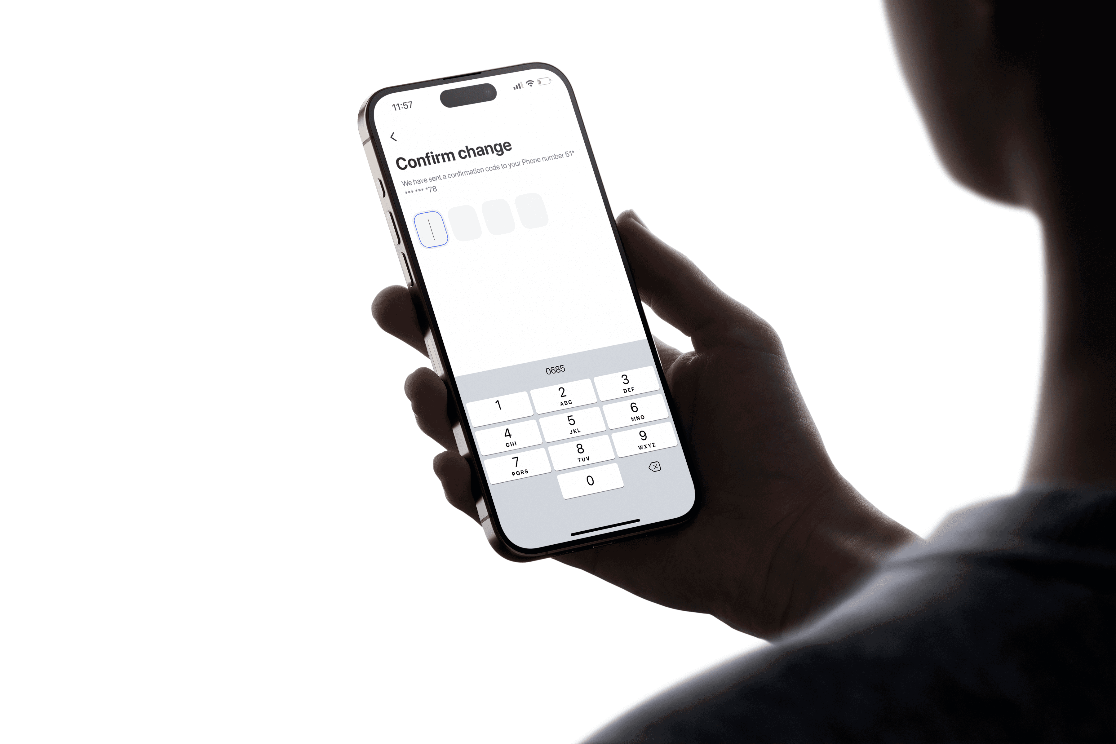
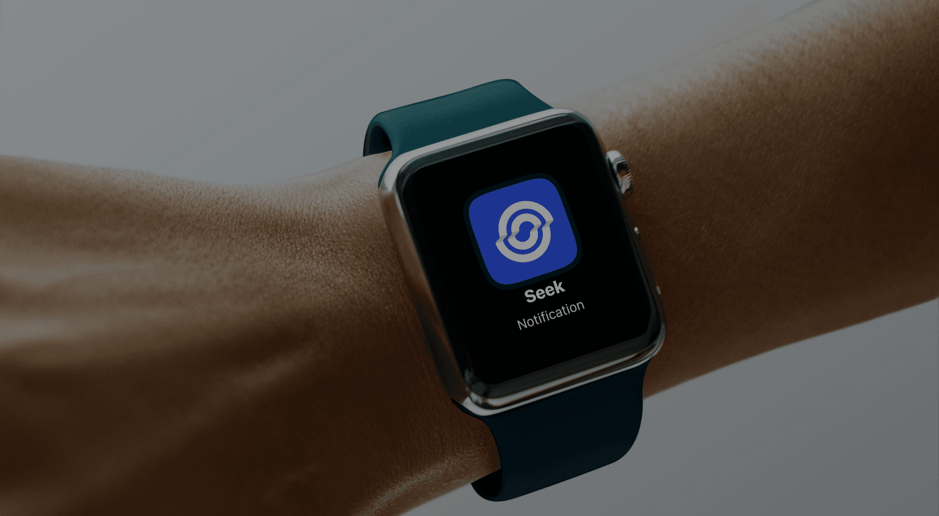
Seek makes job searching simple and easy. Use advanced filters to find offers, review your resume directly in-app, and get real-time notifications for new job matches tailored to you.

impact
As a Product Designer, I crafted user flows, designed intuitive interfaces, and ensured a seamless experience. My focus was on simplifying job searching and addressing user needs.
Key Learnings
Collaborative Decision-Making: Involving developers and stakeholders early on smooths decision-making and reduces the need for rework.
Early User Research: Conducting user research and testing in the early stages ensures the design aligns with user needs.
Evolving Projects: Projects that impact the entire product are constantly evolving. It’s important to start with delivering the essential features, and recognise that there is always room for improvement.
Balancing Complexity and Simplicity: Enterprise design doesn’t always need to be data-heavy. It’s crucial to understand user scenarios and simplify when necessary, aiming for the right balance between complexity and usability.